|
This video shows a time-lapse of designing the poster with a voiceover explaining what I am doing and why I did certain things to add to the overall effect of the poster.
Below shows 3 scanned images of sketches I drew for the magazine poster, including annotations of the what the poster would look like including the colour and conventions included.
This was beneficial as it allowed me to visualise the poster before I started designing it on photoshop, and will give me a starting point.
I put together a presentation of comparing the conventions of two magazine advertisements. This way I know what I am going to need to include in my magazine to make it as professional and realistic as possible....
Remembering the location scouting and research that I did on Haggerston as a location for my music video, which I never ended up filming at, I thought it would be the perfect place to have a photoshoot instead for the digipak and magazine advert. The open garages and the cool houses in the area would make interesting places to shoot, and also represent the indie pop genre well. I contacted a budding photographer that I know, Daisy Finetto, to arrange to take the photos of me. By using her, the photos will look more professional, than if I were to get a random friend to take them, however the fact that she is not a professional will still give the photos the low budget aspect of indie pop.  Below shows an image of Daisy taking a photo of me, and a slideshow of some of my favourite photos from the shoot. I think that the photos suite the indie pop genre extremely well as they are very edgy and unique. 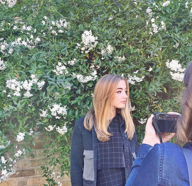 |
