Below shows the final edit of the music video for 'Fall Down'.
|
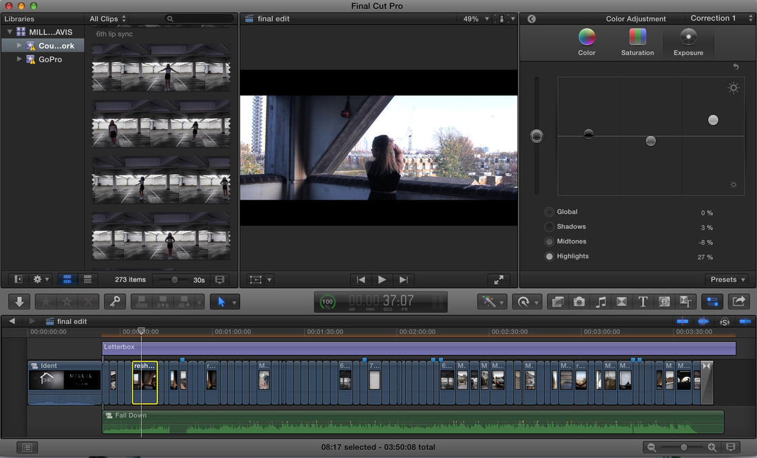
Below shows a screenshot of the final edit of the music video for 'Fall Down'. The image shows various different editing skills, including:
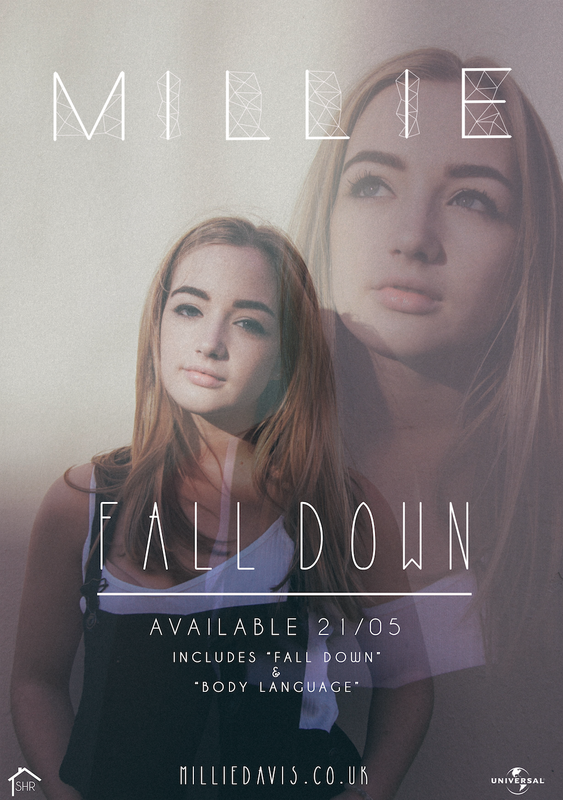
 Below shows a video of the ident that I created to play before the start of the music video. This introduces the record label company, the name of the artist and the name of the music video. A radio tuning sound plays in the background suggesting a retro feel, which demonstrates elements of the indie pop genre. The same font of the artist name 'Millie' is the same font used for the artists name on the front cover of the digipak and the magazine advertisement poster, creating continuity between all three products and enhancing the brand of the artist.
This video shows a time-lapse of designing the poster with a voiceover explaining what I am doing and why I did certain things to add to the overall effect of the poster.
Below shows 3 scanned images of sketches I drew for the magazine poster, including annotations of the what the poster would look like including the colour and conventions included.
This was beneficial as it allowed me to visualise the poster before I started designing it on photoshop, and will give me a starting point.
I put together a presentation of comparing the conventions of two magazine advertisements. This way I know what I am going to need to include in my magazine to make it as professional and realistic as possible....
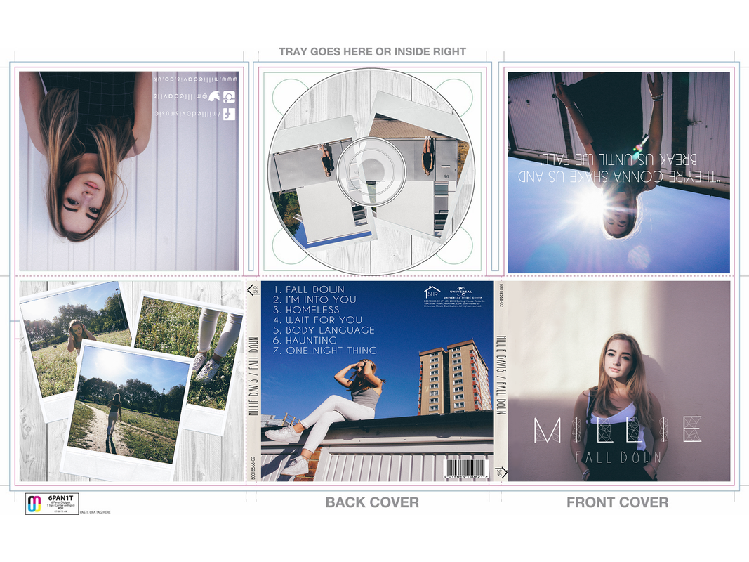
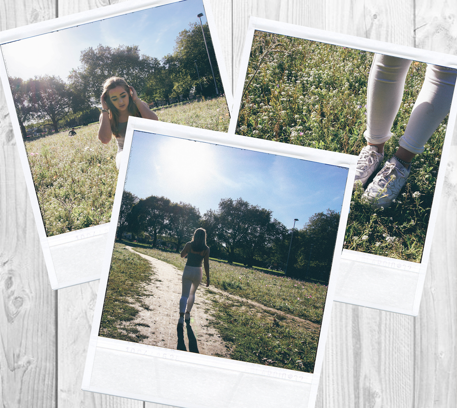
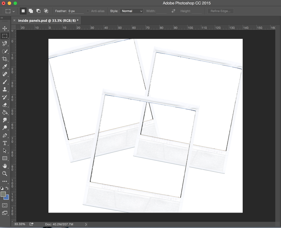
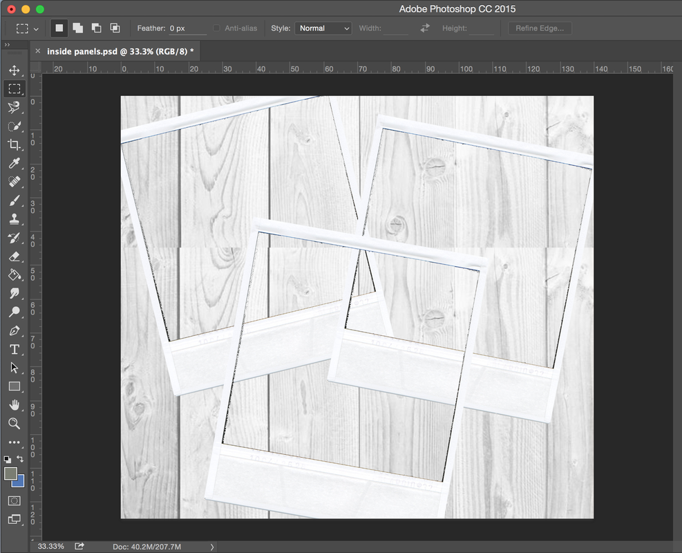
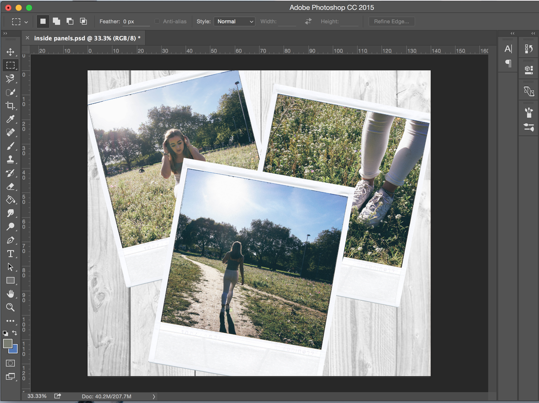
Due to the genre of the album being Indie Pop, I thought that polaroids were a good representative of something different. Polaroids are quite old fashioned, however they are becoming more modern all over again and more of an individual way to take photographs. I decided to use this aspect on the CD of the digipak and link that through to the extra panel as well to create continuity. 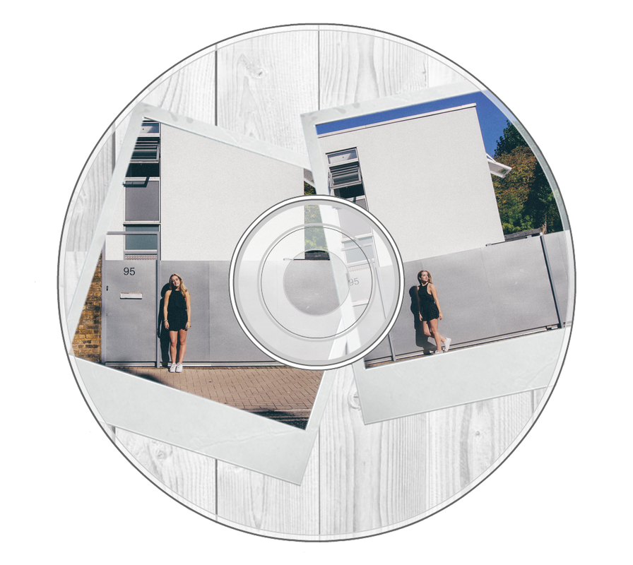  |