This was beneficial as it allowed me to visualise the poster before I started designing it on photoshop, and will give me a starting point.
MILLIE DAVIS
a2 media studies
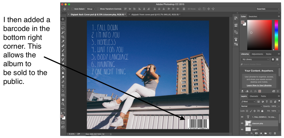
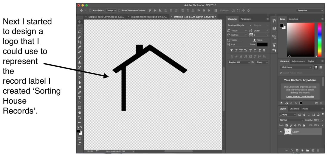
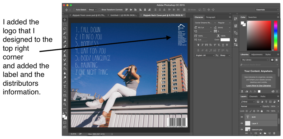
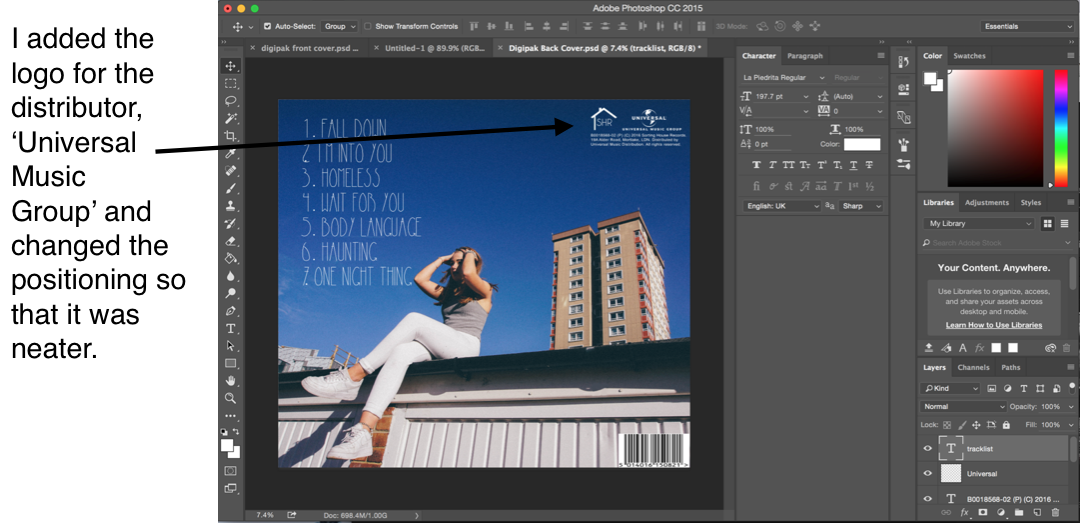
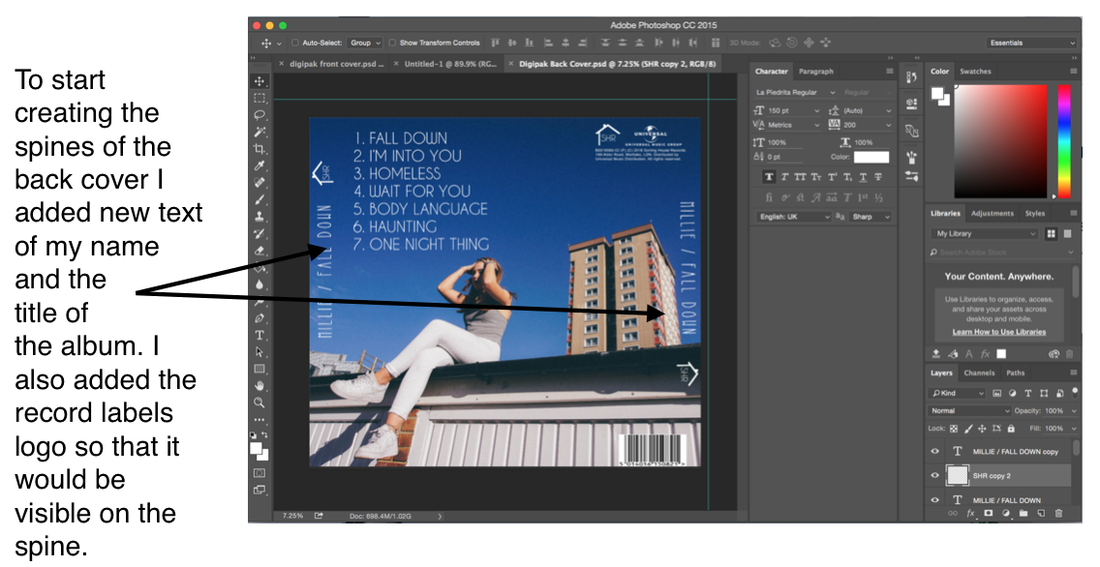
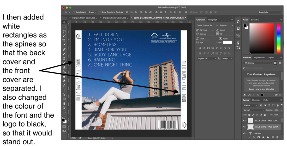
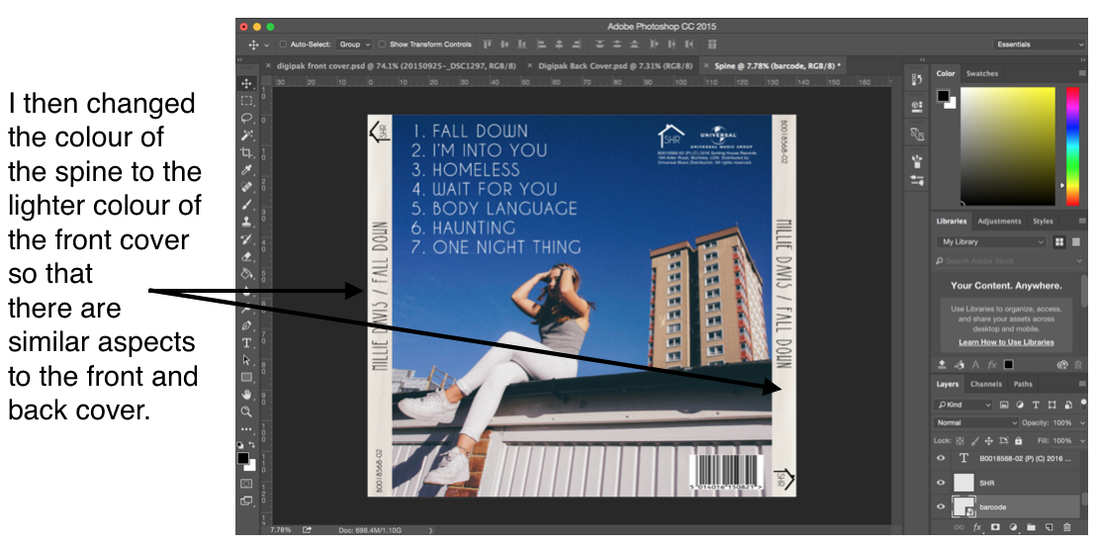
Below shows 3 scanned images of sketches I drew for the magazine poster, including annotations of the what the poster would look like including the colour and conventions included.
This was beneficial as it allowed me to visualise the poster before I started designing it on photoshop, and will give me a starting point.
0 Comments
I put together a presentation of comparing the conventions of two magazine advertisements. This way I know what I am going to need to include in my magazine to make it as professional and realistic as possible....
Due to the genre of the album being Indie Pop, I thought that polaroids were a good representative of something different. Polaroids are quite old fashioned, however they are becoming more modern all over again and more of an individual way to take photographs. I decided to use this aspect on the CD of the digipak and link that through to the extra panel as well to create continuity. Remembering the location scouting and research that I did on Haggerston as a location for my music video, which I never ended up filming at, I thought it would be the perfect place to have a photoshoot instead for the digipak and magazine advert. The open garages and the cool houses in the area would make interesting places to shoot, and also represent the indie pop genre well. I contacted a budding photographer that I know, Daisy Finetto, to arrange to take the photos of me. By using her, the photos will look more professional, than if I were to get a random friend to take them, however the fact that she is not a professional will still give the photos the low budget aspect of indie pop. Below shows an image of Daisy taking a photo of me, and a slideshow of some of my favourite photos from the shoot. I think that the photos suite the indie pop genre extremely well as they are very edgy and unique. Using the website Pinterest, I created a board whereby I gathered inspiration for different fonts that I am interested in for the digipak. I knew that I want to have a font for the artist's name that will stand out, as the image is going to be rather simple, a convention of an indie pop digipak. *CLICK TO VIEW THE PINTEREST BOARD* Once I had finished brainstorming what font I wanted, I decided to go onto the website 'DaFont' to research fonts that are similar in style, by looking through the 'decorative' category. I am going to conduct audience research to find out what fonts are people's favourites, and what they think would suit my brand best.
Below shows a time lapse of practicing my photoshop skills for designing a rough front cover for the digipak. I used a photo of me that was taken at the shooting of the music video in the car park as a template, and I am planning on doing a further photoshoot to choose between a variety of photos for the final digipak. I did this task in order to familiarise myself with photoshop, so that when I have the final images from the photoshoot, I can use photoshop with no hassle. Because I wanted to play around with photoshop, I decided to play around with backgrounds. I have noticed that front covers for an indie pop artist can vary, with one convention being simplistic and the other convention being artsy. For example, Dua Lipa presents an artsy front cover, whereby BANKS presents a simplistic front cover. I created two contrasting front covers to practice my photoshop skills, one being very simplistic with a simple black background, and the other having a tropical background, from an original image of standing in front of a brick wall. |