To gain some inspiration for covers of digipak's, I found an article on Buzzfeed named '7 Female Indie Artists On The Rise'.
The article contains a list of 7 upcoming female indie pop artists, which I thought would be beneficial to me to become knowledgable of how modern young female indie artists are representing and branding themselves.
CLICK TO READ ARTICLE
Below shows a collage of each of these artists front cover of their EP's/albums. It is obvious that bold colours is a key feature of these indie pop front covers, as it makes the digipak stand out. Furthermore, font is also very important. All the fonts that are used for these front covers are eye catching, and are all in capital letters.
Most of the front cover's are very simplistic, with one photo of the artist, complemented by a simple background of a bold colour or black/white.
These front covers successfully reflect the artists and the music/theme of their albums.
The article contains a list of 7 upcoming female indie pop artists, which I thought would be beneficial to me to become knowledgable of how modern young female indie artists are representing and branding themselves.
CLICK TO READ ARTICLE
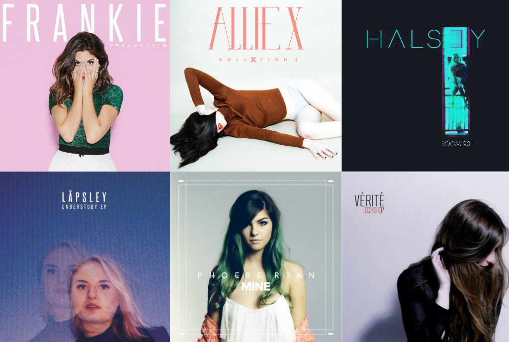
Below shows a collage of each of these artists front cover of their EP's/albums. It is obvious that bold colours is a key feature of these indie pop front covers, as it makes the digipak stand out. Furthermore, font is also very important. All the fonts that are used for these front covers are eye catching, and are all in capital letters.
Most of the front cover's are very simplistic, with one photo of the artist, complemented by a simple background of a bold colour or black/white.
These front covers successfully reflect the artists and the music/theme of their albums.